Showing posts with label blog design. Show all posts

Tuesday, February 10

My New Daughter-Designed Blog Background

Middle Daughter was home from school with me yesterday, both of us trying to recuperate from colds. After posting about Kenny’s cake, I HAD to also get rid of the pink blog background. Apparently, two years ago I liked it. But no more. Yech!

So I went back to bgpatterns.com, my go-to website for years to make my own background images, and boy was I in for a surprise. The creator has totally revamped it. Right around this time, Sophie joined me to eat her lunch. And watched me. And then saved me.

blog backgrounds

On the left is the original background. In the middle was what I was contemplating putting up. (I blame my momentary lapse of judgment on too much medicine cake.) On the right is what my soon-to-be 10-year-old daughter came up with.

I did have to help her make a custom image for the K since the website doesn’t include any letters, but the rest was all her. A little kooky, but for now, I love it!

Oh, and my only beef with the new bgpatterns site is that I couldn’t find a way to make the overall final image smaller. So we had to do that with another app.

But other than that, it was a lot of fun. Need a seamless background image, with your own custom colors and shapes? Try it out: bgpatterns.com

Tuesday, February 28

“Continue Reading” Links – Yay or Nay?

What do you prefer? Hugely long posts showing up in all their fullness on my blog home page and/or your blog reader? Or just the beginning bit followed by a “Continue reading” link?

image

See, I just discovered that what was once a huge undertaking on Blogger is now (as of 2+ years ago, actually!) as easy as clicking the “Insert Jump Break” button. That means, on my blog home page, I can hide the fact that I’m long-winded and picture-happy by inserting a simple “Continue Reading” link after a paragraph or two.

So I did that on a few recent posts. And then I also changed my feed settings, from “full” to “until jump break.”

But I’m not the one affected by this – you are. And I know what I prefer, but I’m curious to hear your thoughts and reactions. (Scroll down to the two Heart Art Party posts to see examples.)

* * *

By the way, I found this info on how to create post summaries on Blogger with “Read More” at Blogger Plugins, written by a guy named Aneesh who seems hugely knowledgeable and helpful, judging by all his replies to people’s comments on various (fantastic) posts of his.

Saturday, October 16

BLOG :: Out with the Grey–In with the Autumn-y

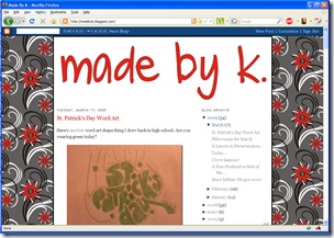
Isn’t it funny how you sometimes love something and then grow to hate it? Well, maybe I didn’t ever love my grey with red flowers background but ugh I certainly don’t like it anymore.

And once I had changed the background, the header looked so empty, so I changed that too…

BackgroundSwitchOct2010

There are lots of online tutorials explaining how to change or add a “tiled” background in Blogger, so I won’t explain it all here again.

But some great websites I used along the way are listed below:

I made the yellow background image at bgpatterns.com

image

If I want to have stripes next time, I’ll go to stripegenerator.com

image

And I could even create a plaid using my very own color choices at tartanmaker.com

image

(I think these would also be a fun place for digital scrapbookers to make their own backgrounds…)

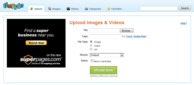
Once I made the image and downloaded it to my computer, I still had to get it onto the Web somewhere so that I could add the link to my Blogger template. Enter the tinypic.com website.

image

You upload a photo, tinypic stores is online and gives you a short address right to it, for example: http://i54.tinypic.com/zwepzs.jpg

So then under the Blogger Dashboard – Design – Edit HTML, I just had to find the body { section and add the link address to the background url.

image

Enjoy making your very own backgrounds. I sure do!

Wednesday, March 18

Before & After: Blog Design

I am SO in the mood for spring and have LOVED the past few days of weather in the 60s. So why in the world did my blog banner still say “Let it snow, let it snow, let it snow”?!? (Well, other than I’m calendar challenged and easily lose track of time…)

So before:

MBK let it snow template with red stripes background

And after:

red title red flower background

Funny, when I first found the stripes for my last background, I really loved them. Now I really don't. I’m sure the same will happen to my current background – I think the grey will get to me after a while. I wish the grey were green. But oh well, I found it fast and it was free (at dryicons.com). So that’s good enough for now.

And just to check that this new template shows bullets accurately, here’s what else I’m up to today:

And that’s as far ahead as I want to think for now…

P.S. Here are the grid pictures we did yesterday:

CAR for Sophie to copy

IMG_1483

ROBOT for Heidi (shown in middle; oh, she was SO careful to get it just “perfect”) but then Sophie wanted to try it too (shown at right; a little more free form; she got really frustrated with the knees—more complex shape than squares and triangles?—so I finally drew some dots for her to follow).

IMG_1484

Wednesday, February 25

Speaking of...

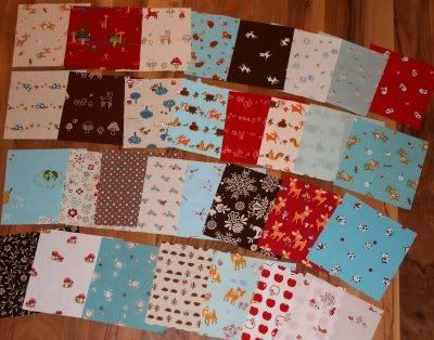
I've been enjoying reading about Kerri's Lovely Little Handmades and seeing her beautiful quilt projects over the past month. Well, she is now hosting a giveaway for some amazingly lovely fabric. Unless I'm super lucky when she randomly selects the winner on Feb 28th, this photo is probably as close as I'll get to all these beautiful reds and aquas and browns... And mushrooms! People, there are mushrooms in the mix! So jump on over and throw your name in the hat. And while you're there, ooh and aah at some of her other stuff.


Speaking of
reds and aquas, this is what my blog wants to look like when it grows up; Shannon's blog design is absolutely fantastic. Which is not surprising since she designs blogs professionally. And her posts ain't too bad either. Was inspired by this one to do this:
I don't like treadmillling when I'm watching TV; would rather be curled up next to Ken. But while surfing, blogging, emailing, finding recipes, etc.? Hey, this just might work!

Was also inspired by Shannon's many fun and lovely cakes, and the last photo of this post in particular, to ask her how she keeps from getting ginormously-huge domes on her cakes, like I do. Her secret: bake at 325 instead of 350. I'll have to try that on my next cake.


Speaking of
cakes, I thought it would be fun to host a little cake decorating class in mid-March for anyone who's interested in trying it (and who lives nearby in SEMinn). With the right tips--I meant metal decorating tips, but "tips" as in "hints" works too--you can do some cool stuff that's really quite easy. Email me directly so we can figure out more details (kmskms at charter dot net). It would probably be a weeknight evening, after the kids are in bed.

(This is a set of "sampler" cakes I made for a friend after she decluttered and gave me ALL her cake decorating stuff four years ago! Jenny, you were talking about being generous? I want to give gifts like this! Want to give the "good stuff" that I don't use -- if I'm honest with myself -- not just the "old stuff" I'm tired of!)


Speaking of
bed, I should go to mine. But hey, I burned over 200 calories tonight!

P.S. Does throwing a few extraneous boards (took 'em off the footboards of the bunk beds) and laying them on the arms of the treadmill warrant adding the "woodworking" category to this post?!? : )

Tuesday, April 22

New (temporary?) layout


Surprise! (to all three of my readers - ha ha) Looks a little different around here, huh? I just couldn't look at that grey and maroon layout anymore. Yech! So rather than update the "family" blog OR this one, I surfed the Internet looking for a new blogger template. I learned something. Free templates are free for a reason.

No, that's mean. There really are some nice ones out there, but hard to find one that really clicks with me and what I'm posting about here. e.g. no coffee cups in my header, thank you very much. I don't drink coffee. And as pretty as mountains and sunsets are, they have nothing to do with my content. Eventually, I found a "notebook paper" one that I liked a lot, til I applied it to my blog and saw how big the text was. I've always liked "college-ruled" notebooks -- this was that other type, but on steroids. My posts were each about 3 feet long. So with a bit of sadness, I kept looking...

In the end, I settled on this one, "color pencils." At least, it conveys the idea of creativity or art. Compared to the pic posted here, you can see I did customize it a little. Wanted to actually be able to read the date text. And there were a few other things I didn't like. So that was a fun foray into CSS. This color chart came in very handy -- must make a note of it for future reference. (I love love love red, but not when all the other accents on the page are blue!)

So what do you think? Is it better? It'll probably (hopefully) change again, but in the meantime, is it readable? Anyone? Anyone? Buehler? Buehler?

LinkWithin

Related Posts with Thumbnails